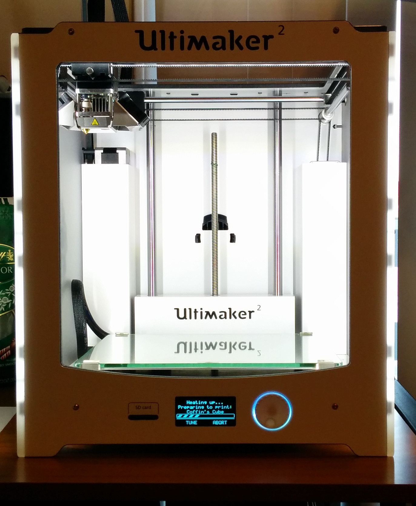
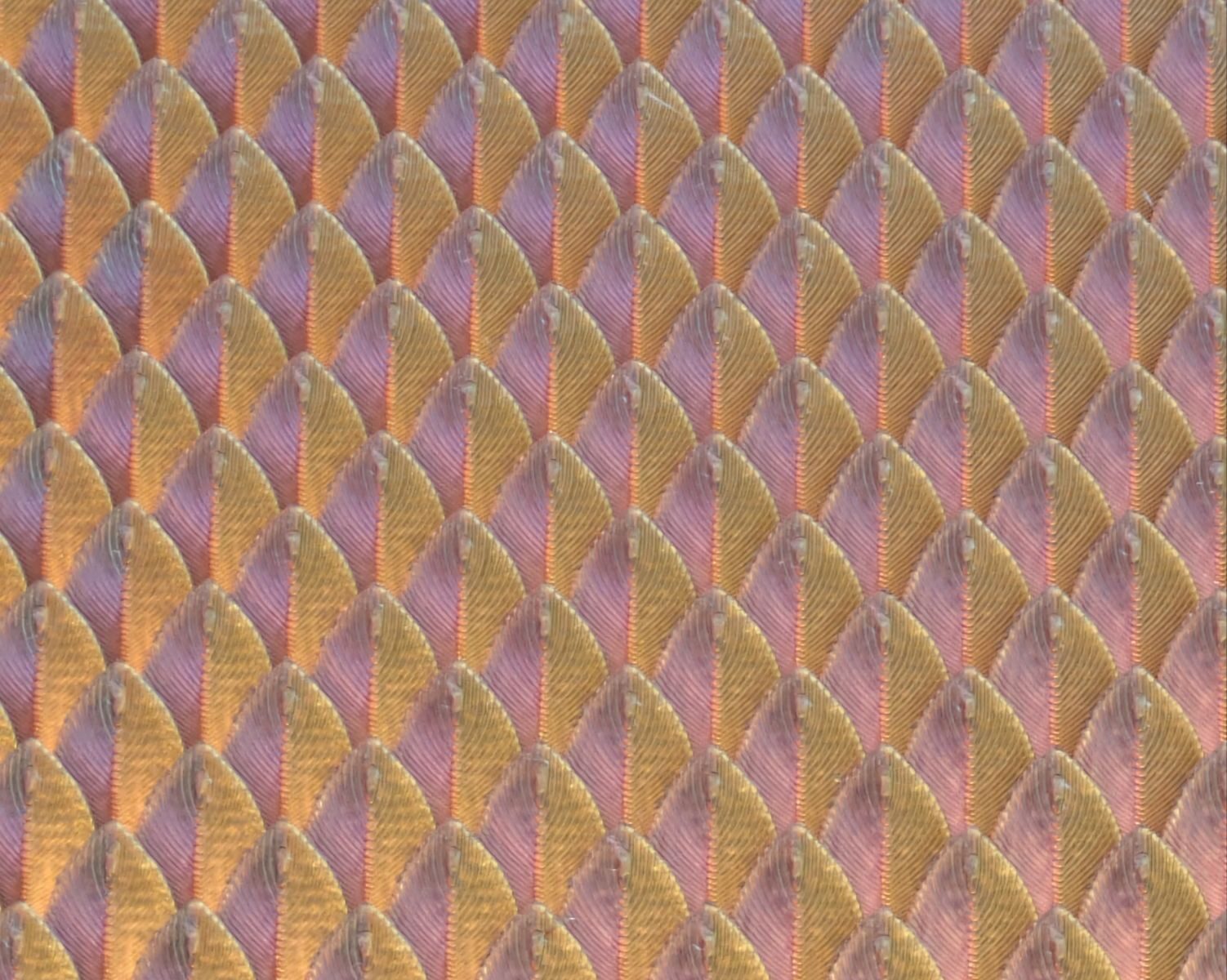
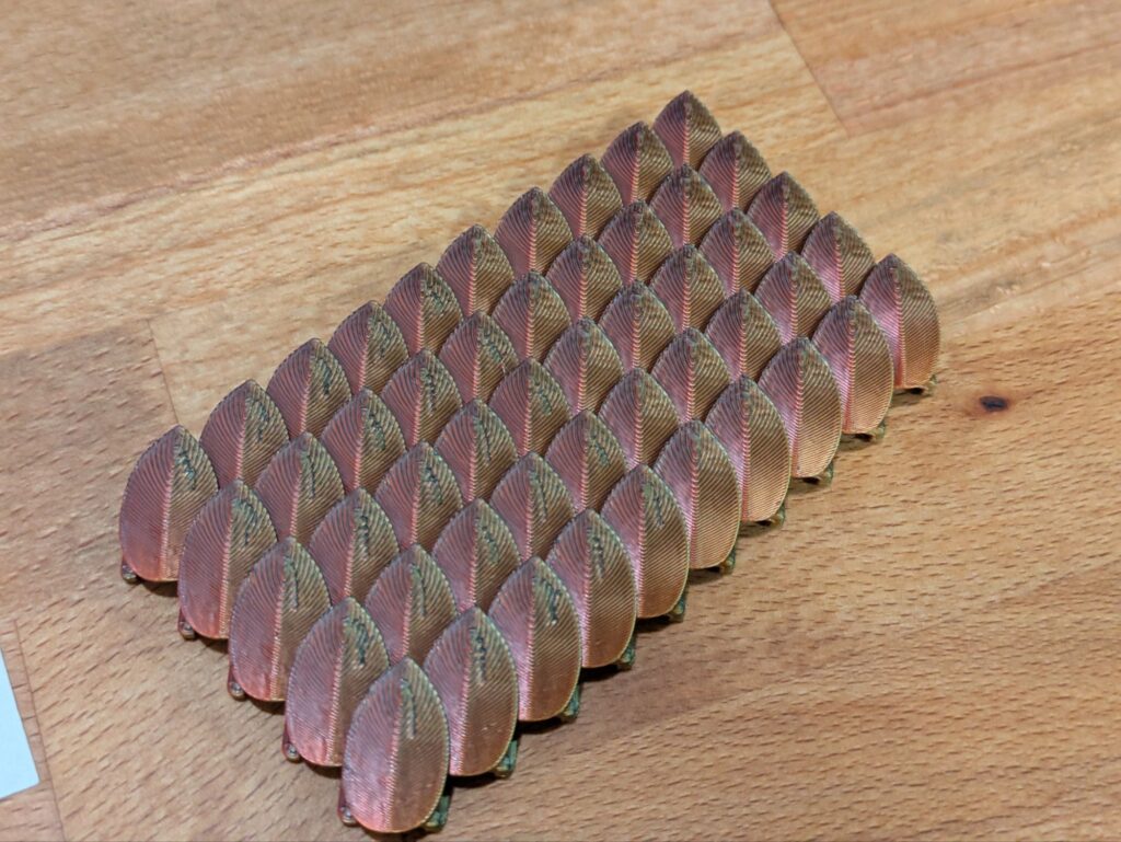
I got some tri-color red/black/gold filament that would be really cool to print out as scale mail, so I found a promising looking model, and gave it a go, but I didn’t like the results, and so we go on the print profile optimization journey to printing out perfect looking scale mail.
Scarf Seam
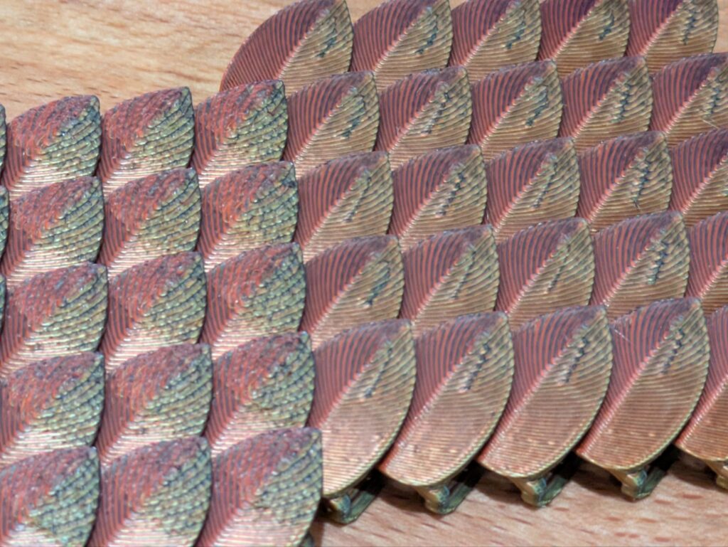
The first print I tried with it ended up coming out with a fair bit of mess on the top of the scales. I found this original mess was coming from the default scarf seam option in Bambu studio. In most prints this is a good option to use, but with the tri-color filament on the sloped surface of the scales, it ended up looking pretty bad with the colors blending and the lines looking wavy. Turning this off made a major improvement to the quality of the print.
Infill Wipe
An additional spot of blemish came from wiping within the infill of the print. Since the slope was shallow enough, the infill could affect the exterior finish of the print. To reduce this, I increased the number of walls since those were using slightly different settings than the infill rounds. Those settings then respected the seam location to hide everything on the back of the scale.
Support Locations
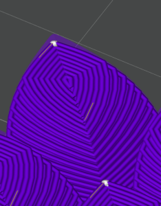
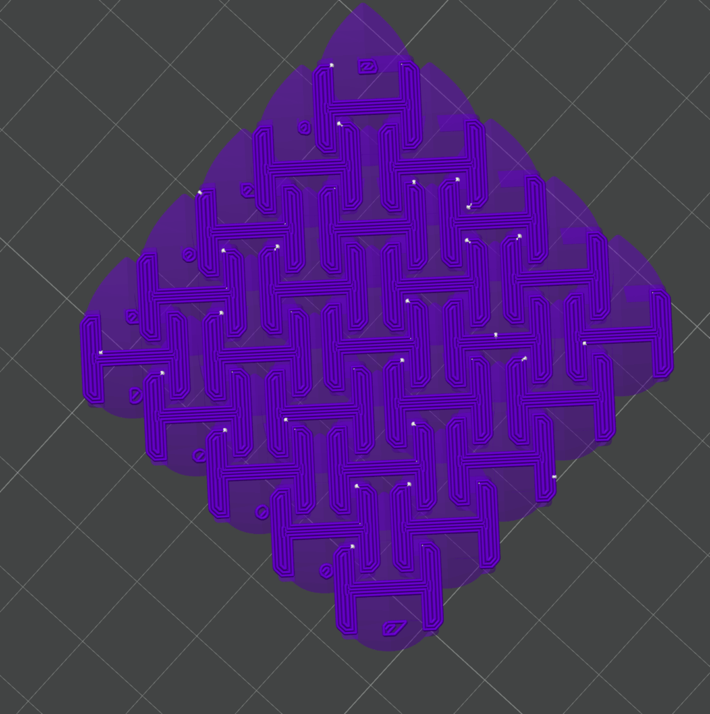
Since I was updating the scale design to add in scales that could be connected after printing, I ended up needing supports in certain locations around the edges of the scales. To avoid these causing issues, I had to paint the support locations on and make sure I checked the sliced files before printing. The shot below shows some of the very small issues in the slice that caused big issues in the print.
Seam Location
Another tweak I made was to paint the seams on every part, not allowing them to use the default locations this way I could hide the seams on the back of the scales and ensure the cleanest surface possible on the print.
Print Orientation
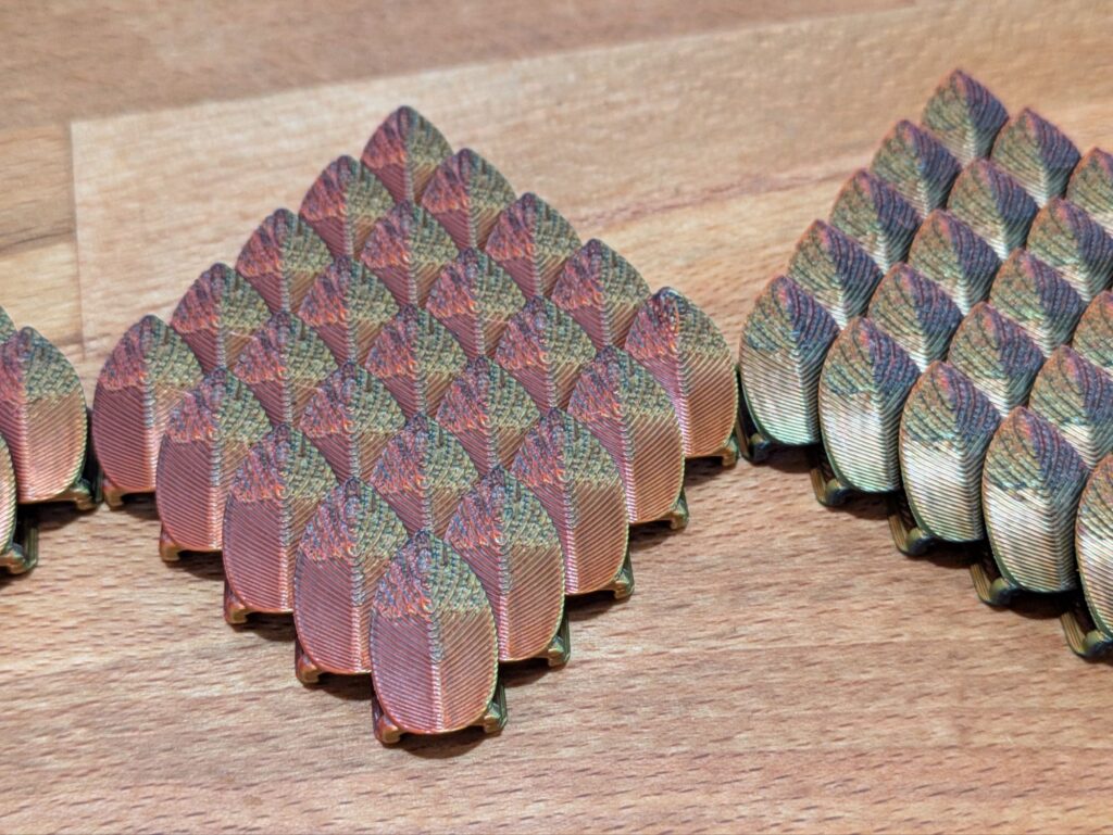
I also messed about with print orientation to see how that affected the color of my final print. I liked the default orientation primarily red color so I went with that overall, but the black and gold looked great as well.
Final Result
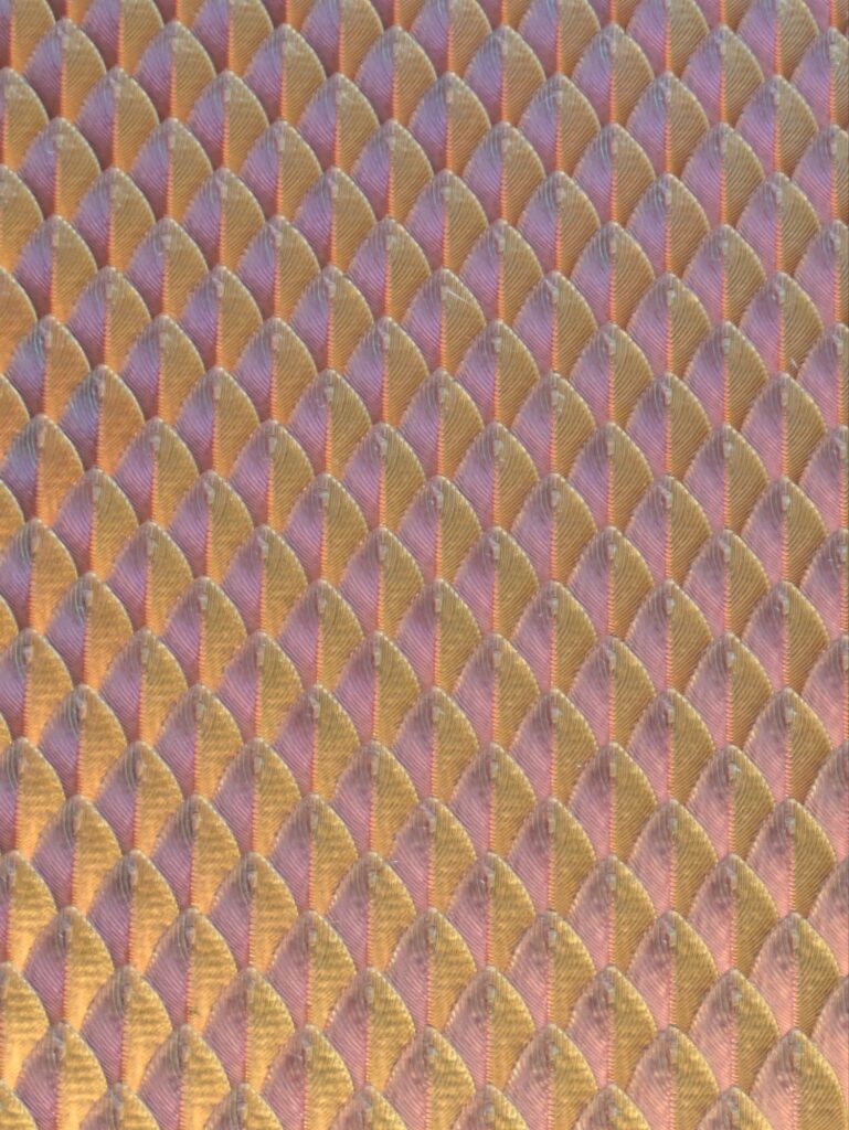
The final result was very clean scale mail. All the seams on the back of the scales and the shape itself worked together to create a very clean surface that turned out great.
TLDR:
- Paint the seam locations to not be on the top of the scale (or really, where they won’t be seen).
- Turn off Scarf Seams (they overlap too far for small detailed objects).
- Use additional walls to hide infill wipes.
- Try a few orientations to get the color effect you’re going for.